
If you're new to Webflow, we strongly suggest enrolling in the Webflow 101 Crash Course. This introductory program from Webflow University provides a comprehensive overview of the fundamentals and vital knowledge necessary to start creating your first Webflow website.
Styling
Let's get started with the styling of the template.
Customising colours
This template utilises the Global Color Swatch feature, which allows you to effortlessly modify colours, ensuring instant updates across your entire site.
To customise the colours to your liking, follow these steps:
- Go to Typography in the Style tab.
- Choose the colour you wish to change.
- Click on the edit icon located in the lower right corner.
- Select your desired colour and save your changes.
And voila! Your colour updates are complete.
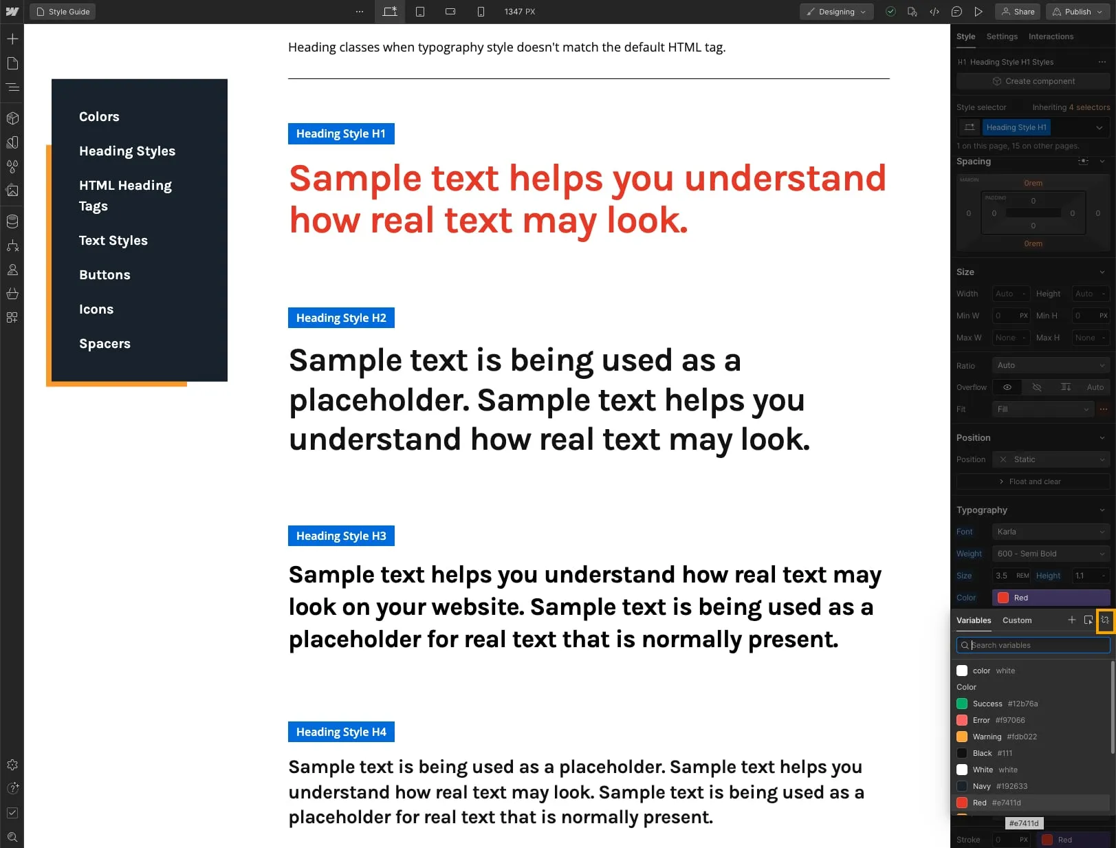
Currently, the colour is set as a variable. When you edit a variable colour, all colours sharing the same variable will be changed. If you wish to change a specific colour, please click on the unlink icon (inside the yellow square) to detach it from the variable. It will not affect other elements.
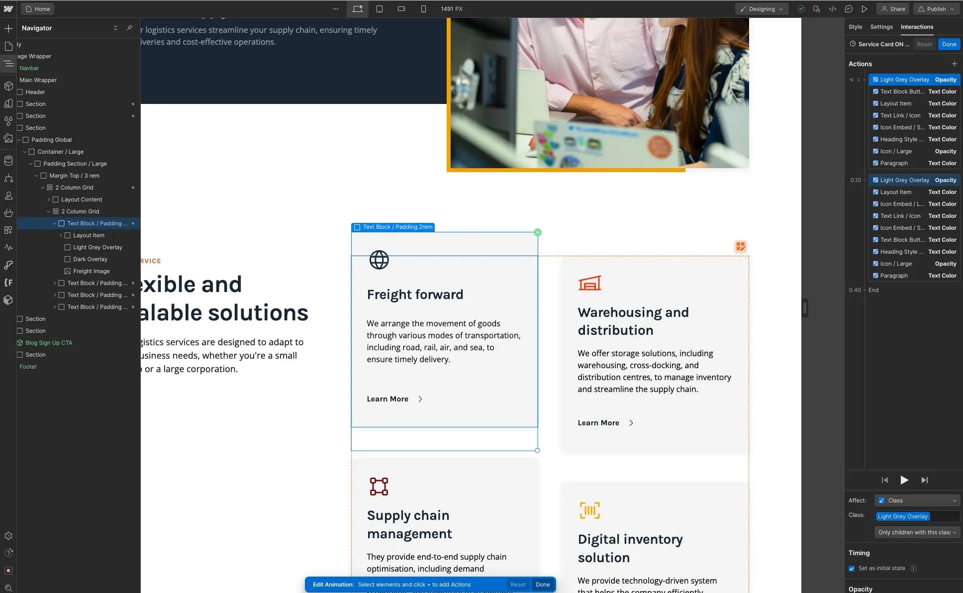
Updating the colour of SVGs
To modify the colour of SVGs, follow these steps:
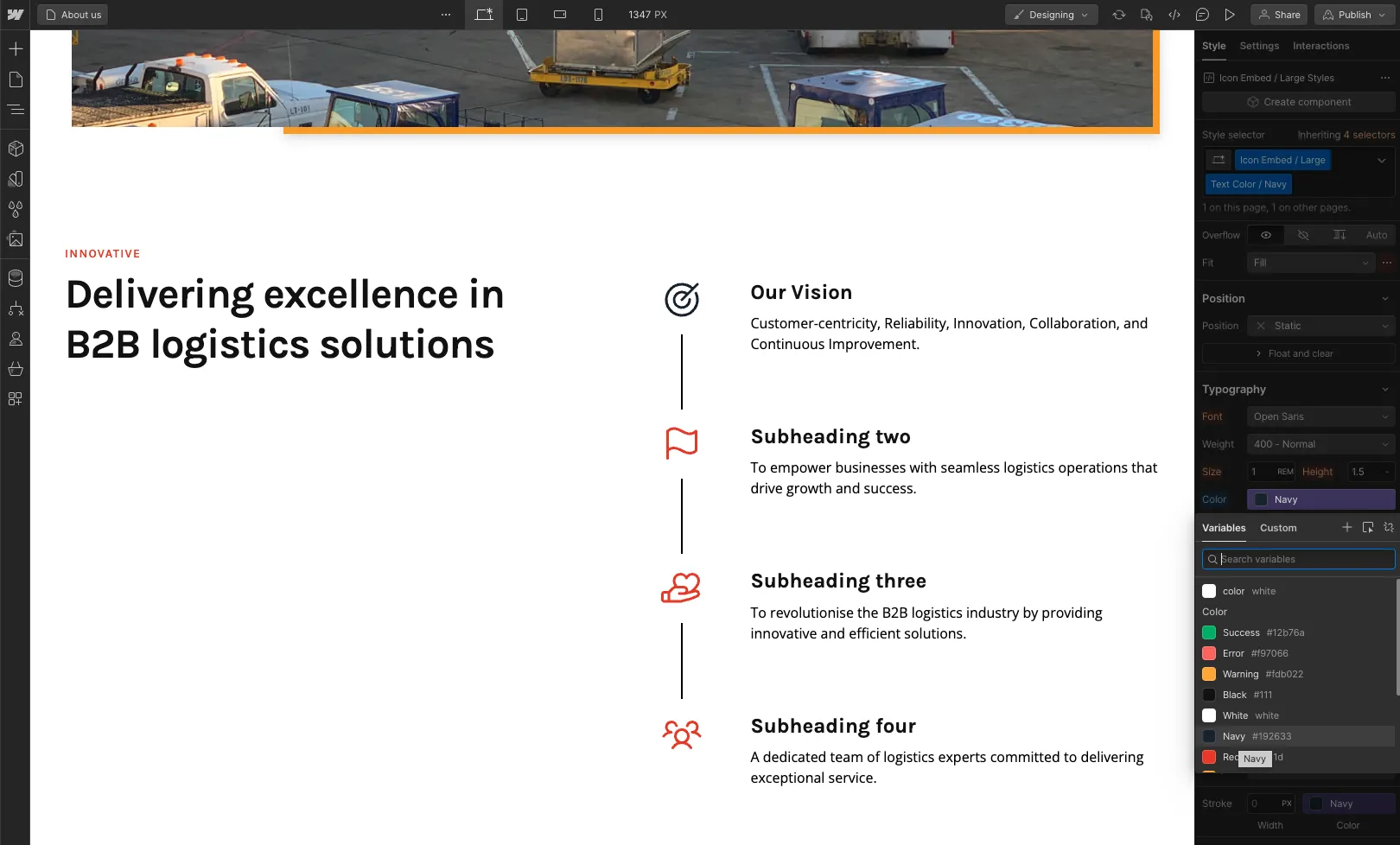
If you wish to modify the SVGs named "Icon Embed", you can easily change the colour using typography swatches as following image.
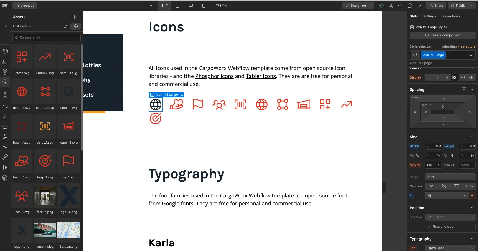
If you wish to modify svg files from the Assets section:
- Upload an SVG file into the Asset Panel.
- Insert SVG file into the page section and select the class name "Icon Height / Preferred Size" from the style panel on the right side.
By following these instructions, you can easily update the colour of SVG elements to suit your preferences.
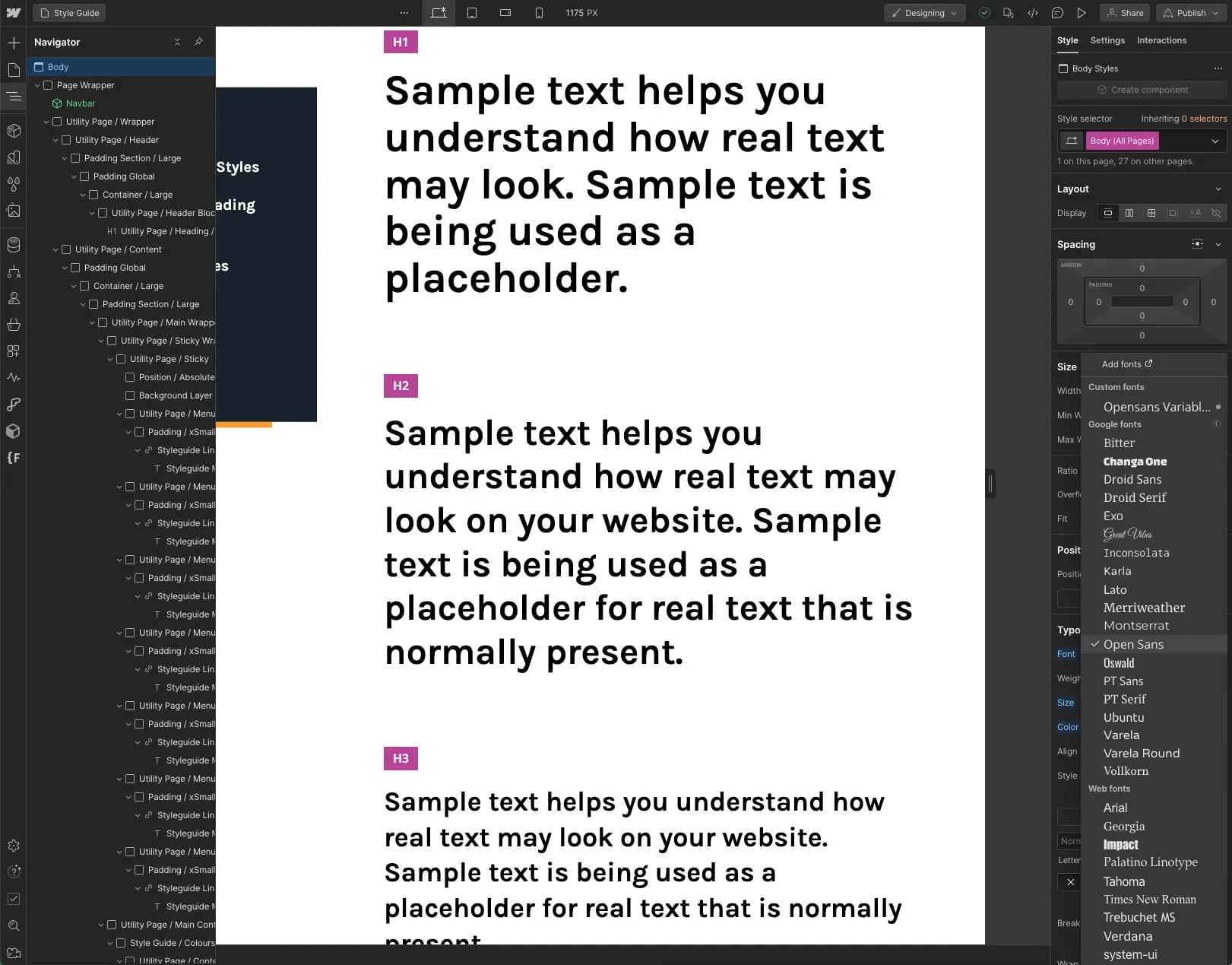
Changing fonts
The fonts used in this template are free for your use.
Body (All pages): Altering the body font will have an impact on all fonts throughout the entire site.
Heading (All headings): Modifying the heading font will affect all heading fonts across the entire site.
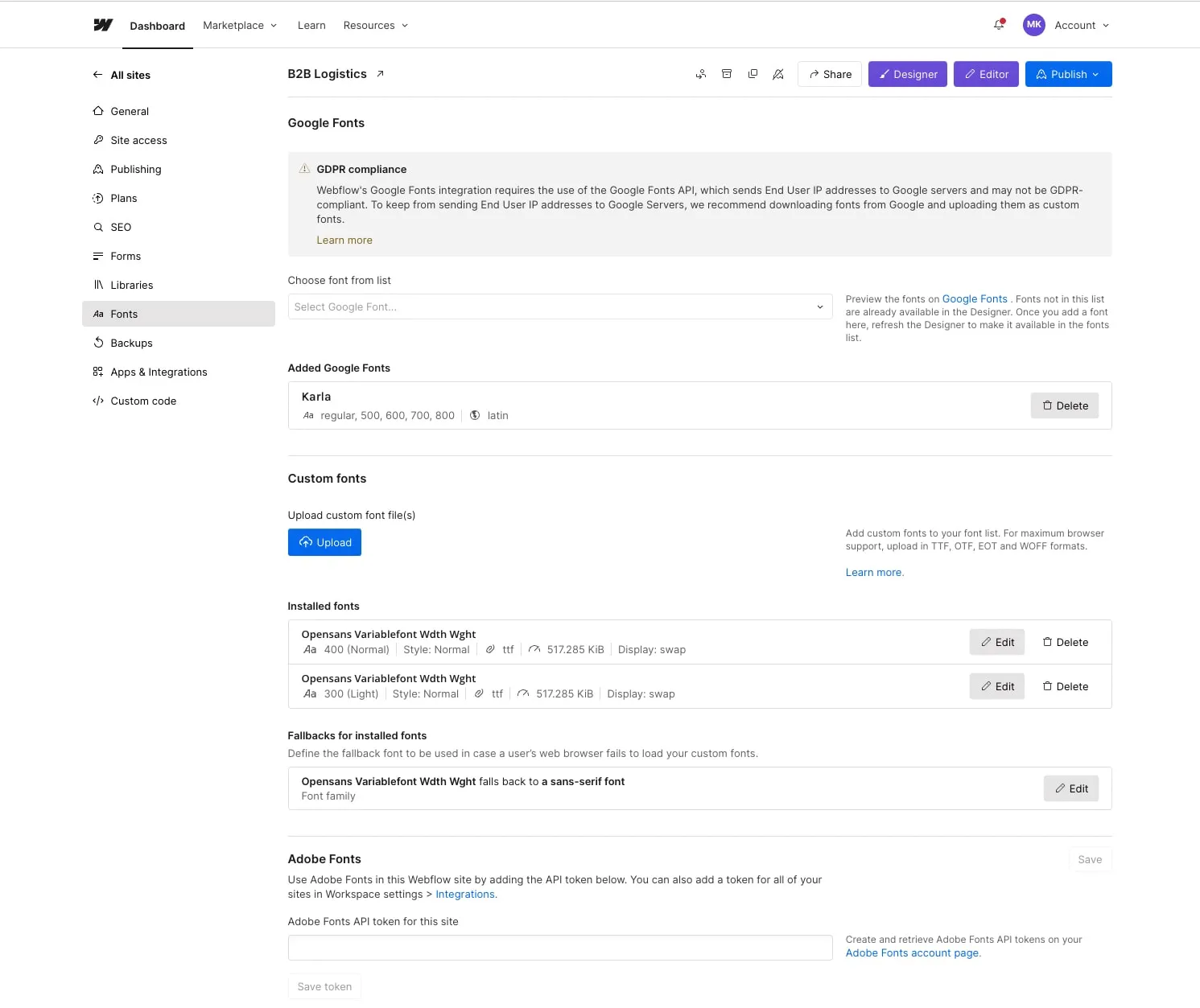
If you wish to change the fonts, you can easily do so by navigating to Project Settings > Fonts. From there, you have the option to upload custom fonts, utilize Google Fonts, or even connect your Adobe Fonts account.
Once you have uploaded the font in Project Settings, click on the orange selector option located in the top right corner of the Style tab. Choose "Body (All Pages)" and then proceed to the Typography section below to make the desired font adjustments. Remember, modifying the body font will impact all fonts across the entire site.
Changing length and height
In this template, we use "REM" for the length unit. REM is defined relative to the font size of the root element and by default, most browsers use a font size value of 16px. Since a user can set the default size of this element from their browser settings, the webpage can scale to match a user’s preference. Using absolute units like pixels, however, creates accessibility barriers. Pixels override the document’s root font size, meaning the user’s preferences are ignored. Therefore, use rem units for any scalable elements where possible.
Here is a link to PX / REM converter https://nekocalc.com/px-to-rem-converter
Editing pages
Now let's move on to the next steps for editing your website pages. Typically, there are two types of content that you'll be working with, which are the following:
Static
Static content refers to all the non-CMS-based content, which means it's not dynamic (unlike a Blog Post, for instance).
Identifying this type of content is simple: it appears as grey in the left sidebar Navigator and displays a blue border when clicked or hovered over.
To edit this content, simply double click on it, and you'll be able to type directly in the designated area.
.webp)
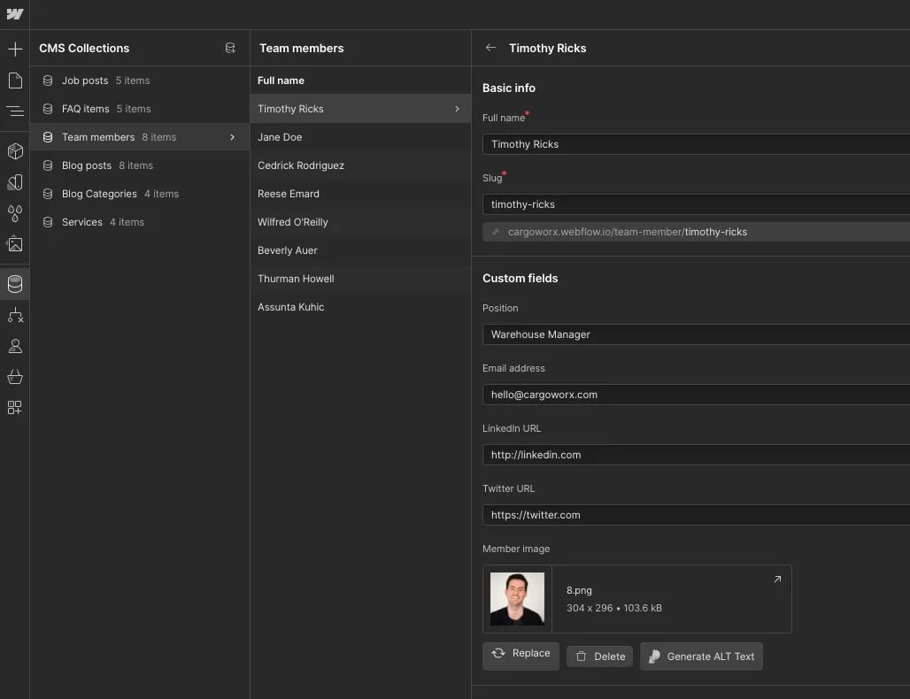
Dynamic Content (CMS)
Dynamic content refers to all the content that is generated automatically based on the information added in the CMS section, located in the left sidebar just below the Pages icon.
This type of content is easily recognisable: it appears as purple in the left sidebar Navigator and displays a purple border when clicked or hovered over.
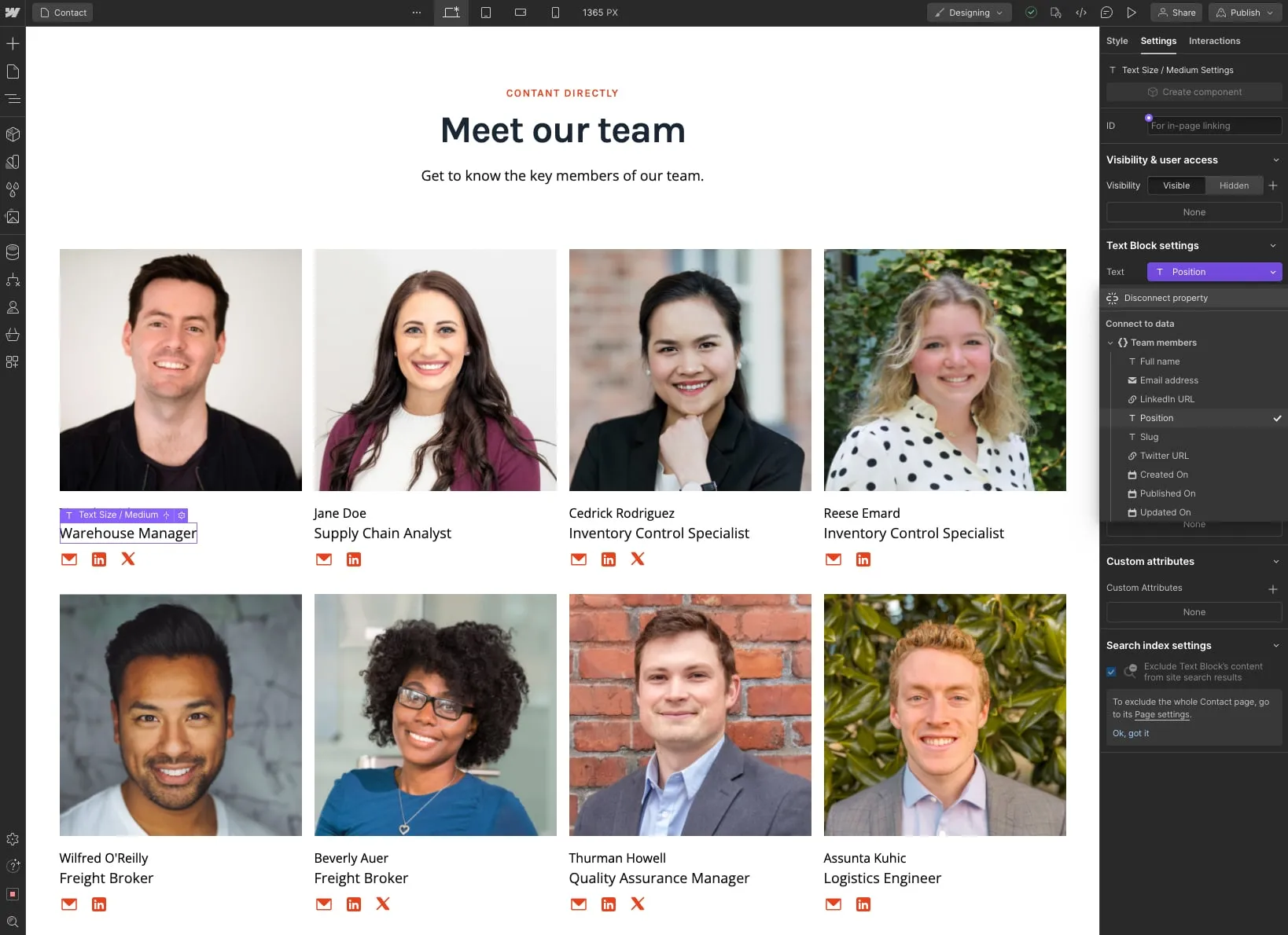
This content should be updated directly in the CMS section. This streamlined approach makes it exceptionally convenient for you to make updates, considering that it will likely require frequent modifications (such as adding new blog posts).
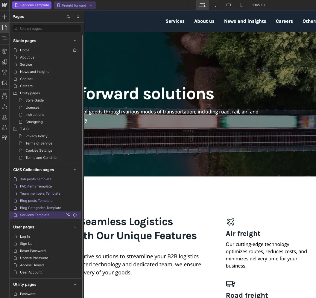
Additionally, if you wish to edit a fully auto-generated CMS page (such as a Blog Post), you can conveniently find this page listed at the bottom of all the pages in the Pages section of the left sidebar.
Useful Notes
Also than the main basic explanation we shared above, here we share a few tips and how-to's which are from the most common questions we receive.
Interactions
We've supplied a selection of pre-made scroll-into-view interactions which you can apply to any element you like, these include slide interactions, fade interactions and zoom interactions.
To access the interaction panel, click on the element you'd like to add an interaction too in the navigator panel, then click the interaction tab, which is in the top right of the page, the lightning icon.
Tablet and mobile view
Every time you make a modification (such as creating a new section design), it's advisable to follow a good practice of navigating to the Viewport section in the top navigation. This allows you to preview how your changes will appear on Tablet and Mobile devices, ensuring a consistent and visually appealing experience across different screen sizes.
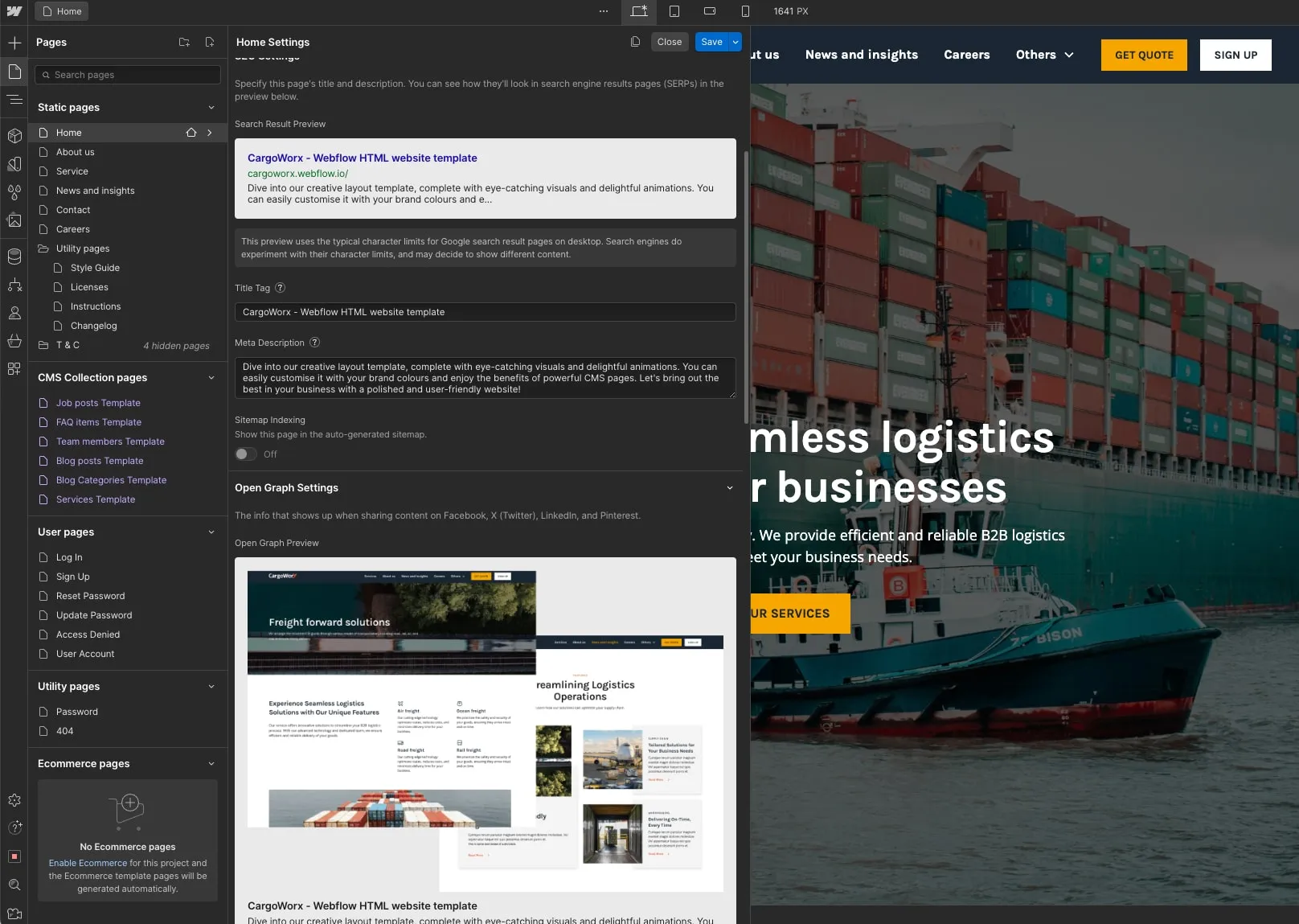
Editing Meta Title, Description, and Featured Image:
If you wish to personalise the Title, Description, and Image that appear when you share your website on various platforms (such as Facebook or Twitter), you can effortlessly do so by accessing the Pages section in the left Sidebar. Simply click on the small Settings icon next to the page you want to customise, and you will find all the necessary settings right there.
Backups
In case something doesn't go as planned—for instance, if you're dissatisfied with the direction your website is taking, accidentally deleted important classes that affect the template's appearance, or simply want to revert to a previous version for any reason—you can always rely on the Backups section.
The Backups section provides a safety net, allowing you to access previous versions of your website and restore them if needed. It's a valuable resource to ensure peace of mind and flexibility during your website development process.
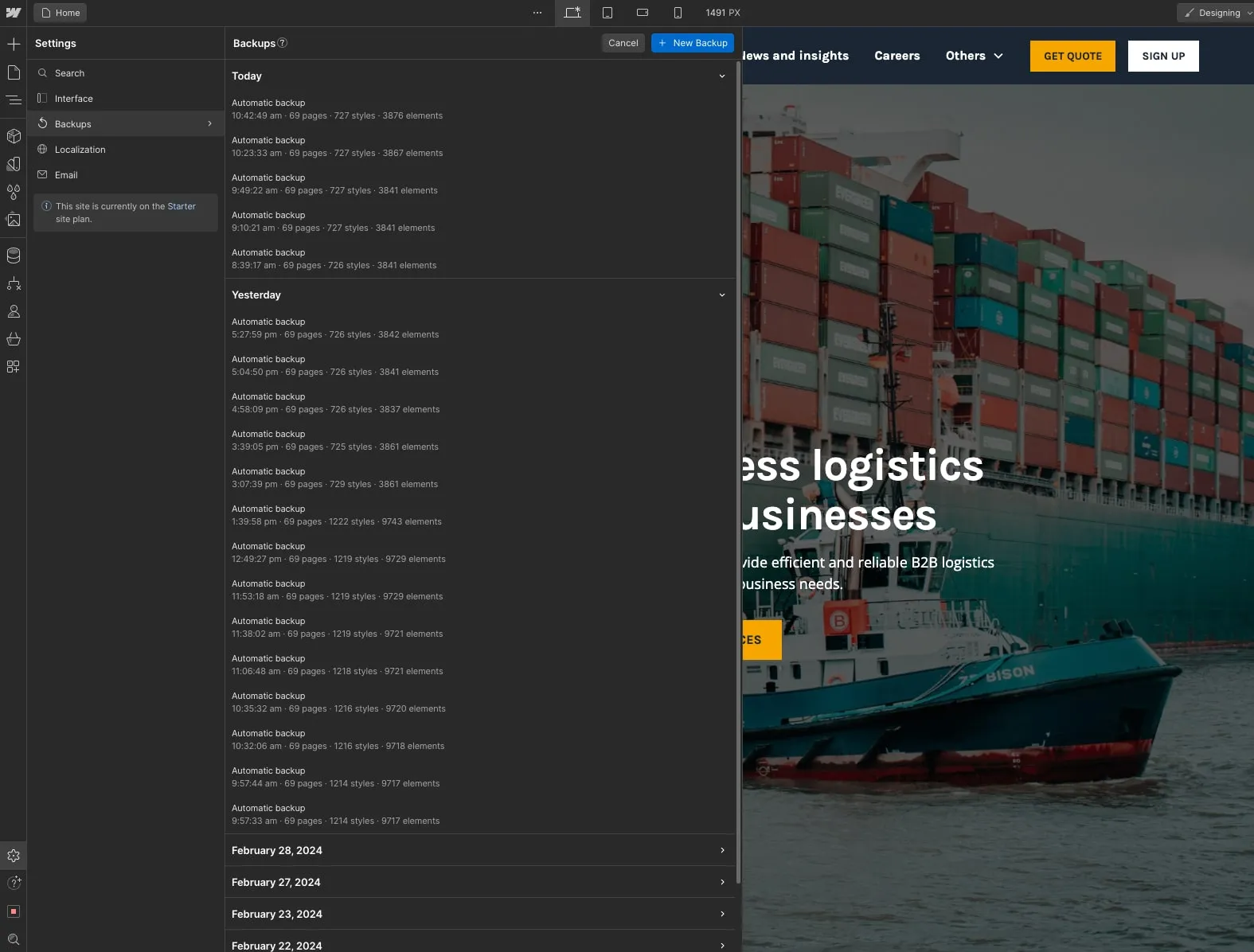
Locating the Backups section is simple. Just head to the Settings section in the left sidebar, and you'll find it bottom of the sidebar (cog icon). Once you're in the backups section, you can conveniently view all the automatic or manual backups that have been created.
Restoring your website to an older backup is as easy as a single click. This feature ensures that you have the flexibility and control to revert to a previous version whenever necessary.
Template Support
Get in touch
We're here to assist you with any questions or concerns you may have. For prompt support, please get in touch with us through the Webflow template support page, and we'll respond to you promptly.
Custom Design & Development: If you require custom design and development services using Webflow, don't hesitate to reach out to us. Feel free to contact us here for further assistance.